Designing on Target – What is right for your audience?
To design for your audience you need to understand whom your audience is and how they read what you are designing. As you may know, reading something on paper is very different from reading something on a computer screen.
Web Usability Expert, Jakob Nielsen, wrote the article, “How Users Read on the Web.” Nielsen claims that people don’t read web pages, they scan them for information. His research shows that when people are looking for information, they scan the page and read the key words, meaningful subheadings, and bulleted lists.
This is why you need an expert designer to help you with your website. You can’t simply add a few design elements in different locations on a web page and hope to capture your target audience.
Reading printed pieces are easier on the eyes than reading text on a computer screen. However, you don’t have time to spend fumbling through lots of text to get to the few bits of information you need.
At Tribe Design, it’s our job to constantly reevaluate how your audience digests the graphic designs we create—no matter what form they take.
While most of our clients are business to business, we truly tailor to each of our client’s target audience. With a recent project for Lee College, we got the opportunity to design a recruitment piece for high school students and seniors. We needed our design to resonate and be appropriate to an audience of young adults.
The copywriter for this piece used a physical journey and exploring new paths as a metaphor for life. The copy essentially asks students what their next step from High School will be. It highlights how Lee College can give them a great start in an exciting career at an affordable price.
Since the content for this project is imperative for the target audience to read, we had to create a design that would reel the readers in. Given that the target audience for the brochure is high school students, we wanted one of the designs to be fresh and modern. For the first design, we used bold, bright colors and interesting textures to draw the reader in.
For the second concept, we took the theme of “Life is a Journey” a bit more literally and came up with a treasure map design. Initially, it was a larger format that unfolded like an actual map might. Our client showed our initial designs to a student focus group. They responded well to the treasure map concept but suggested making the format a tri-fold like the first design study.
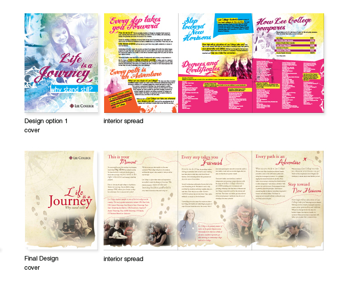
Based off the results from the student focus group, the map design was more appealing to the students. They were able to make a connection to the title of the piece.
“Lee College appreciates its relationship with Francisco and his associates at Tribe Design. Besides their amazing talent, they listen.
Tribe has worked with us on several major publications in recent months. In every case, Tribe gave us quality options to consider. Then, when we presented input from student focus groups, Francisco’s team listened carefully to the input and made important revisions. They went the extra mile to create outstanding publications that blended the needs of our audience with great design. And every publication came in on time and on budget.
Lee College considers Tribe Design an outstanding creative partner, and looks forward to many more projects in the future.”
— Steve Lestarjette, Director, College Relations
When you need professionally designed marketing or branding materials for your business, find a design team that you can trust to blend the needs of your audience with great design.