How Color Trends Can Help Your Brand
If you’re updating your visual brand, it’s good to keep in mind what colors are on trend. We’re not saying that your brand needs a color update every season, but if a color refresh is part of your rebranding initiative, even subtle modifications can help your new visual brand come to life.
At Tribe we approach the design process with color trends in mind. But does this work for every client? The answer is: the colors for your brand have to feel right, connect with your target audience and conceptually match what you are trying to communicate.
We’ve combed through the 2013 color trends and picked the top 4 to consider with your next visual brand update.
1. Color Blocking
While you hear about this trend a lot in the fashion world, it translates well into graphic design for the right business or organization. With the use of clearly defined colors you are able to emphasize important brand information with a strong look.
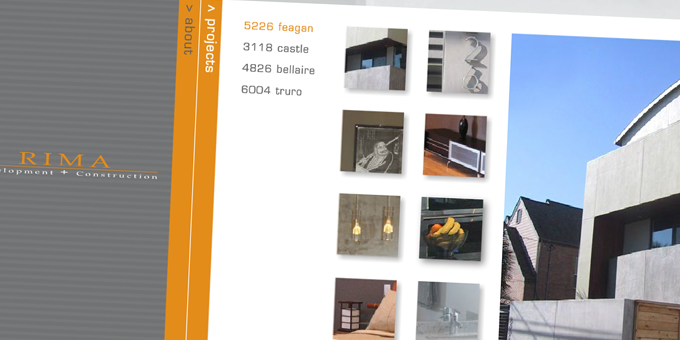
This trend works well with minimalistic website designs like RIMA Development and Construction. With the use of strong colors and this no nonsense design, this website brings the user in to find exactly what they are looking for.
2. Greyscale with Bright Accents
By choosing one or two bright colors to draw your eye in, it’s easy to direct your target audience to the important information on your website, logo, brochure or other marketing materials.
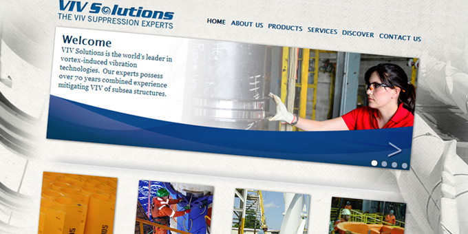
With VIV Solutions we were able to highlight the images they wanted to the user to see right away with the bright colors. Using the greys, we gave the design a polished finish for a soothing user experience.
3. Muted Pastels
Mixing neutrals and soft pastels creates a relaxing atmosphere that feels welcoming and organic. This color pallet allows you to use more colors than you would normally. Because there are only subtle differences in each color, the user can move throughout the design without feeling visually overwhelmed.
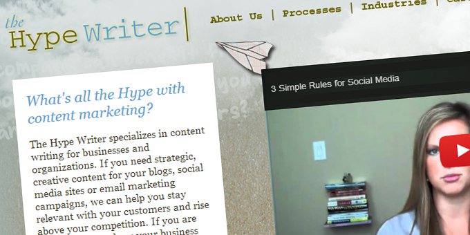
With The Hype Writer we created an organic feel with the use of pastels and neutrals. The sight is visually appealing and draws the user in to learn more.
4. Neons and Brights
Brights may make you feel like you are back in the 80s and 90s, but when it is done right, it creates an element of excitement for the user.

Take Growing Up Wild as an example. With the use of bright colors throughout the design it is visually appealing to families with an exciting vibe that makes the user want to take action.
Would your company’s new image benefit from any of these color trends? If so, we’d love to help you create and shape your new visual brand. Contact us today to see how we can help your Brand Building by Design.