What is the difference between Fluid and Responsive Web Design?
There are an increasing number of websites that are becoming responsive. However, there are some websites that may look like they are “responsive”, but are in fact only “fluid”. There are subtle but important differences between these two web programming approaches.
Fluid, also known as liquid, is just like it sounds; a layout that grows and shrinks to fit the “container” – in this case, the screen size. Take an elastic band, draw some boxes on it, and then stretch it; that is fluid design in a nutshell. This type of website takes less time to design and program since the layout does not actually change. The content simply resizes proportionally to the screen size and/or to each other. But what looks good on large screens may not look good on smaller ones. Images, text, and a sidebar may end up getting squished to fit onto a mobile screen, making the website look crowded and harder to navigate.
A responsive website, however, not only changes size, but if necessary, re-organizes the layout/content to better suit a viewer’s screen. Imagine taking the content from a newspaper and having to fit it into a magazine and a pamphlet. If you did this with fluid design, you would end up with the same columns getting narrower as the paper got smaller. A responsive design uses the same content but changes the layout (depending on screen size) to be visually appealing and user friendly. In some cases, a responsive website will remove elements, like a sidebar with less pertinent info, to give more room to the main content area. Responsive design requires developing more layouts (desktop, tablet and mobile) for a single website so that the user experience can be optimized for different screen sizes.
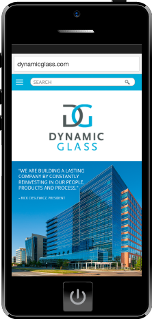
With more than 50% of mobile users using mobile as their primary means of going online, we feel that responsive web design is the way to go (and well worth the time investment). We recently launched a responsive website for our client, Dynamic Glass, http://www.dynamicglass.com. Here are a few words from our client and their experience working with us,
“We have used Tribe Design for three separate marketing projects (logo, brochure and website) and each time they have far exceeded our expectations. Francisco and his team did a great job getting to know our business, culture and market reputation before starting on any of the designs. They listened to our ideas and turned a fragmented vision into an eye-catching reality. What sealed the deal for us were the numerous positive reactions from our customers and suppliers commenting on how great our new logo and website look. I can’t thank Francisco enough for helping us tell our story to the market in an engaging way. I look forward to working with Francisco and Tribe Design long into the future and would highly recommend them to anyone searching for marketing design and support.” – Scott Coulter, Chief Financial Officer
If you are currently working on a website design, ask your web designer or web programmer if your site will be truly responsive or just fluid. Ask them to show you wireframes and web mock-ups indicating how the content will be displayed on different devices. If you need assistance, please feel free to contact us for a free consultation.