4 Web Design Trends to Watch for Your Business
The point of your website is to convert visitors into buyers while promoting your business in these highly competitive times. Your website needs to capture the attention of each visitor and entice the visitors to learn about your company, create an interest in your product or service and, of course reach the end goal, Sales!
For businesses with a limited budget and time, design is crucial for both engaging and then converting potential customers. Keeping this in mind, here are four design trends that businesses can utilize for a great effect.

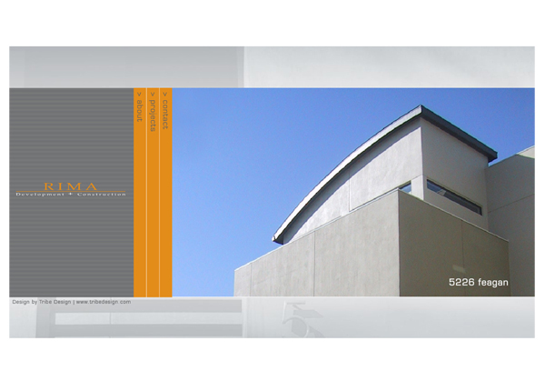
1. Minimalism – While this design trend has been around for a while, it is worth trying as no business owner wants to have a cluttered, overbearing website.
Try these tips to help you minimize your website:
- Prune any unnecessary widgets.
- Make use of whitespace.
- Choose the right color palette.
- Browse your site through the eyes of your visitors.
With Google now using Site Speed as another tool for search engine ranking, it’s a great time to re-examine how streamlined your design is.
What does Site Speed mean? Exactly what is sounds like, how fast a visitor of your webpage can click through your website. Google Research shows that visitors spend less time on slow sites. Faster sites not only improve your experience, but also reduce operating costs.

2. Obvious Call to Action – As a business owner, you want your visitors to complete a certain task when they land on your webpage. It could be to fill out the contact form, follow your blog or sign up for something, but these “calls to action” must be obvious to the visitor on your website.
Here are a few tips to follow when designing your call to action:
- Keep your language short and to the point, but also explain the value of this action.
- Make sure that your call to action is consistent with the location and obviously visible on each page of your website.
- Make it large enough to stand out, but not overwhelming to the design.
- The color of your call to action statement should be contrasting and stand out from the other colors used on your website.

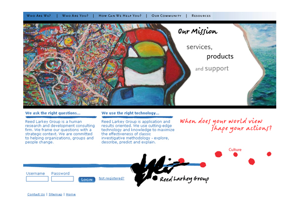
3. Distinctive Photography – We have all seen the usual business picture of people sitting around a conference table or shaking hands. Its time to break away from those cliché images.
Try to use custom photography or artwork whenever possible. For some business owners, time and budget are limited. The use of stock photos are a relatively cheap and accessible alternative.
Keep these tips in mind when choosing stock photos:
- Check out your industry and competitors. Make sure the photos you want are not in use.
- Think of an out-of-the-box way to represent your company
- Don’t opt for low-resolution images just because they are cheaper. Those images could devalue your overall look.

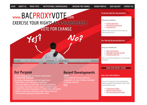
4. Bold Typography – Your website is all about communication with text and pictures. Typography is an important aspect of the design communication and typically brings order to the information. This creates a visually pleasing experience that connects the reader without their knowledge.
A recent trend is the use of big, bold typography. This trend helps to create contrast between other content while grabbing your reader’s attention and making the message loud and clear.
To utilize this trend effectively keep these tips in mind:
- Understand the qualities of the message your want your audience to understand and then look for typefaces that portray those qualities.
- Try to match the character of your work to a font, but don’t forget about legibility for your audience.
- Test font replacement options such as TypeKit of Typotheque. These tools allow you to experiment with unique typography.
These are the top four web design trends making a statement today that businesses can use to enhance their websites. Which web design trends would make the most positive impact on YOUR business?
