Are Your Marketing Pieces Consistently Fresh?
Consistency is a re-occurring theme in our blog, but this time we are talking about bringing consistently fresh ideas to a reoccurring project. As most businesses struggle with this concept, some capitalize on their reliability. For example, David Letterman features reoccurring segments like the Top 10 List, Dumb Ads and Viewer Mail. His audience looks forward to these segments because they have proven to be funny and innovative time and time again. Do you bring this type of reliable originality to your clients every year?
What steps do you take to reach your sales goals year after year? If you have competition, you have to be innovative with your business marketing. Does your design team create new material for your products or services to stay ahead of your competition? If not, that needs to be in your marketing plan.
We pride ourselves and have grown our reputation on the reliability to stay consistently fresh with our work. How do we do it? Here are five simple tips from our creative side.
- Don’t Reinvent the Wheel – Use your experience and the differences from years past. What worked, what didn’t?
- Keep Up With Trends – If it’s appropriate, introduce a popular new trend or recommend stepping out of the box.
- Find Inspiration from Unrelated Industries – Use trends from outside of your industry and see how they can relate with your business.
- Capture Your Environment – Keep your camera phone handy. Capture anything that catches your eye. When it comes time to start a new project, browse through your collection for inspiration.
- Take Breaks – When you are stuck in a project, take a break. Get some fresh air and let your mind relax so you can get your creative juices flowing again.
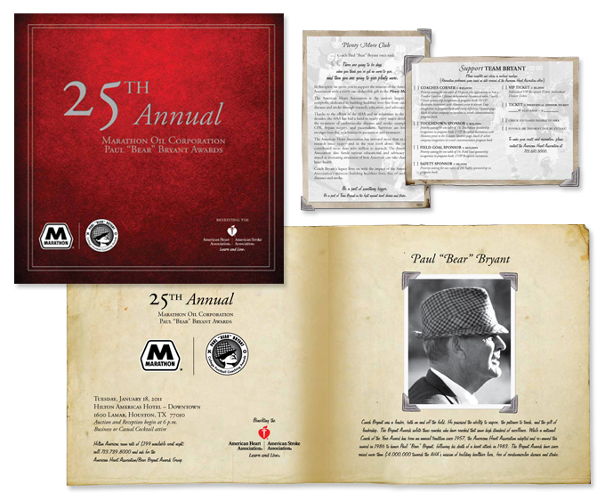
Our client, American Heart Association, puts on the “Bear” Bryant Awards annually. We have been designing the marketing materials for this event for the past five years. They count on us year after year to provide innovative material and ideas. This year was no different.
Since this was the 25th Annual “Bear” Bryant Awards, we wanted to do something special to commemorate the event. The invitation has a worn-in, vintage feel. We wanted it to feel like an old photo album that takes people back in time to an era of great coaching and great football.
The color palette is very simple and muted. A red cover to represent the American Heart Association, black and white photos with silver photo corners, since silver is the traditional color of a 25th Anniversary, and cream colored paper.
The final package honors the 25th Annual “Bear” Bryant Awards as an established and distinguished event full of rich history.

If your current design team hasn’t been wowing you with fresh ideas on a consistent basis, it may be time to change. Consider Tribe, we’d love to help!
