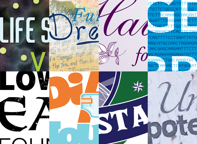
What does typography say about your brand image?

Type says volumes about your brand image. It literally spells out what message you are trying to convey to your audience. But before the message is even read, the nature of the typography speaks for itself. Is it textural or clean? Rounded or angular? Traditional or modern? Careful consideration of type choices is critical to creating a cohesive brand image for any company or organization.
Before a designer chooses the right fonts and type treatments for your logo and other branded materials, they must first know what your company or organization is all about. A thorough understanding of a company’s accomplishments, aspirations and culture should be a starting point for creating a brand strategy and overall look. This message should be reflected in the type and graphics used printed and electronic media.
Creating a unique logotype for your brand and using font choices wisely will make any branded piece look more cohesive and professional. Staying consistent with these choices and their uses will also be important in creating a strong brand image. Consistency is the key, especially for a new company or brand image.
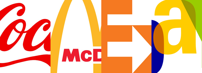
Consider products and services you may use in everyday life, such as Coca-cola, McDonald’s, FedEx or Ebay. The type itself has become the brand’s symbol. You don’t even have to read the word to know what it is and what the brand stands for.

Whether it be for a non-profit organization or a large corporation, type plays a huge roll in creating a company’s identity.
