Learn how we took our branding expertise back to school
Back to School! Back to School! Are you tired of hearing that yet? Well instead of taking notes in a classroom, one of our clients has a great educational program that engages young children and connects them with the great outdoors.
We have been working with the Council for Environmental Education (CEE) for over 10 years. In 2009, we collaborated with them in creating a visual brand for their program, Growing Up WILD.
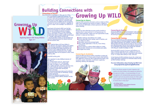
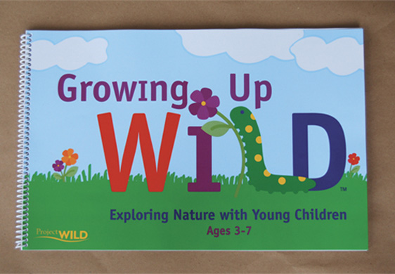
The Growing Up WILD program is designed to teach children ages 3-7 about the natural world around them. The goal was to develop a professional brand identity for the new program to attract educators into adopting GUW into their curriculum. CEE called on Tribe to help create the logo and workbook cover design.

When the program launched, over 40 thousand workbooks were distributed, turning this into their first national environmental publication. Growing Up WILD quickly reached 49 states and Canada. This was a huge success for the Council for Environmental Education and they attribute this to the strong, professional brand image we helped create.
Growing Up WILD’s workbook is already into its fifth printing in two years. One of the goals of this program is to expand the reach to underserved children. By partnering with groups like Head Start and YMCA, they are on their way to increasing awareness.

With the green light to expand the brand, we incorporated cohesive graphics to create a kid-friendly, feature-rich website design for Growing Up WILD. The website was created to increase brand awareness, attract new education partners and expand the program to new countries. Growing Up WILD’s website officially launched this week. For more information and ways to get involved with this program, click here.
“Tribe did a wonderful job. The design is more modern and reflective of the program. Since the launch, the program has won several awards including a Family Choice Award and an award from the National Science Teachers Association. This year, we decided to run with the success of the program and add some bells and whistles. By adding videos that truly reflect the program on a national level and recognizing the need to redevelop the website, we knew we needed to engage Tribe as an outside resource for professional graphic design.”
– Geoffrey Castro, Marketing Manager

About the logo design:
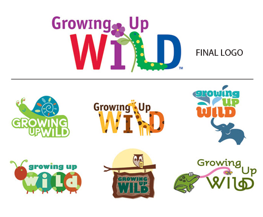
After receiving logo sketches from another design firm that were less than impressive, CEE called on Tribe Design to step in and revamp the project.
The logo needed to be fun, bright and colorful to convey what type of audience the program is designed for—young children. After experimenting with merging typography with various stylizations of animals, the logo finally came into its own. Using a caterpillar as the “L” and flowers as the i dot, became a nice combination of type and image while still being a legible logo. The caterpillar became the chosen animal to represent the program because it is such a common North American creature that can easily be found in anyone’s backyard.
