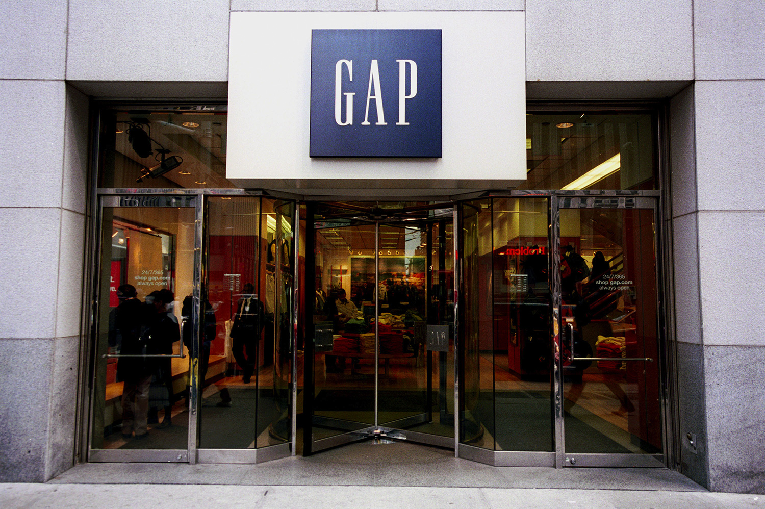
Gap’s New Logo

As you may have heard, the clothing company, Gap, recently launched a new logo. Gap is one of the most popular American clothing brands with net sales of $3.8 billion in 2009. Through their advertising, Gap has established a relaxed, lighthearted and sophisticated brand visual language that has stayed consistent with their square logo. Without any trumpet blast, Gap rolled out a new logo last week. When some customers first saw it, they thought it was only a seasonal change, but now there is no doubt it was the new logo.
Gap Inc. includes several other popular clothing and accessory brands such as Old Navy, Banana Republic, Piperlime and Athleta. Each brand has a unique logo that helps establish the visual brand image. Do you think Gap’s new logo helps communicate Gap’s brand image appropriately?
http://www.underconsideration.com/brandnew/archives/dont_mind_the_gap_or_the_square.php
Many bloggers and fans of the brand weren’t happy with the logo change. Were they unhappy because of change or the fact that the logo may not do the brand justice? Now that we are in the social media age it doesn’t matter why they didn’t like it, what matters is how much of a buzz is put out over social media sites that is negative about the logo and the Gap brand.
We first heard about this from Twitter saying, “Check out this terrible new logo for Gap!” without any chance of readers to be optimistic about the design. Like most businesses that redesign their logo’s they had the right idea. Marka Hansen, the President of Gap said in a Huffington Post blog post “Our brand and our clothes are changing and rethinking our logo is part of aligning with that. ”
When looking to update your company’s logo you need to think about the possible backlash of not consulting with a professional and not designing with your brand image in mind. You need a logo that keeps a positive image in your target customer’s mind.
You have invested a great amount of time and energy to your company to make it successful. When you are looking for an updated look that still encompasses who you are and what you do keep these 5 design tips in mind.
#1 Simple
Stick with an image that is balanced and clutter free. Make sure to use an easy to read font that is pleasing to the eye. Be certain this new simple look doesn’t warrant an unsophisticated change to your brand image.
#2 Distinctive
Make it easy to see at a glance and use graphic imagery that is appropriate for your business. For example, like its clothes, the old Gap logo called attention to itself by being elegant without being pretentious.
#3 Cohesive
As we mentioned earlier, you worked hard on your company growth and brand throughout the years, don’t forget about it when re-designing your logo.
Old Navy is Gap’s lower-end retail sister. If your company has several brands under your company umbrella, keep in mind each brand’s place and purpose. Some Gap customers are saying Old Navy’s logo now has a more luxurious look than Gap’s.
#4 Clear
Make sure your logo communicates clearly about what your business does. When you re-design your logo, you may want to do something completely different, but your logo still needs to communicate your brand appropriately without confusion.
#5 Easy On The Eyes
People say looks aren’t everything, but when it comes to logos, they are. Make sure your logo looks great in color and black and white. Does Gap’s new logo look good in black and white?
After a lot of negative feedback through Twitter, Facebook and Blogs, last week Gap decided to ask their fans on Facebook and Twitter to submit their own logo designs. And then earlier this week Gap announced they would revert back to its old logo. This shows you the power of social media sites and their potential impact on your business.
As you know, not everyone embraces change, but when you revolutionize your company logo or brand image you need to invest the time and correct resources for the most positive results, which now includes introducing it to your audience with a positive social media buzz.
